Bliinder
The challenge
A blind dating app primary targeted to women. 3 features are requested by the founder- the date to be set right after a match occurs (no chat available), women photos to appear blurry for the men after a match, and a blind date key question to be assigned to each date to use as a signal who's the "mystery" date when the two actually meet.
Since digital dating is such a saturated market, the intention here was to create a product that is beyond another trend by learning what women's needs are not being met in existing apps and delivering it in this app.
The goal
Turn initial 3 feature ideas into an app, make the app standout among others and appeal to women
Target audience
Primarily- women, secondary-men
Execution scope
Product
The goal
Turn initial 3 feature ideas into an app, make the app standout among others and appeal to women
Target audience
Primarily- women, secondary-men
Execution scope
Product
The goal
Turn initial 3 feature ideas into an app, make the app standout among others and appeal to women
Target audience
Primarily- women, secondary-men
Execution scope
Product
The goal
Turn initial 3 feature ideas into an app, make the app standout among others and appeal to women
Target audience
Primarily- women, secondary-men
Execution scope
Product
The goal
Turn initial 3 feature ideas into an app, make the app standout among others and appeal to women
Target audience
Primarily- women, secondary-men
Execution scope
Product


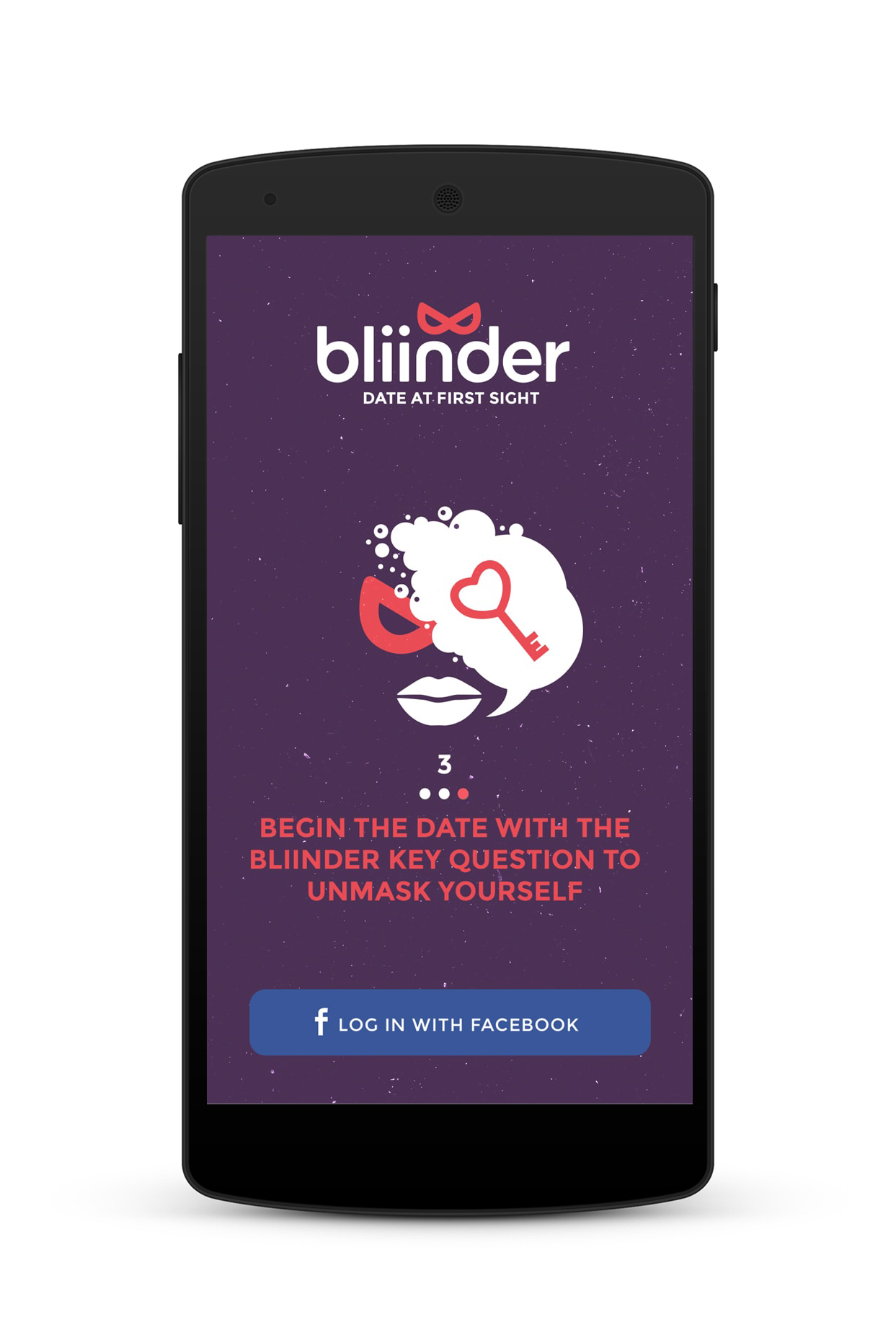
Chosen concept
Tailored to women
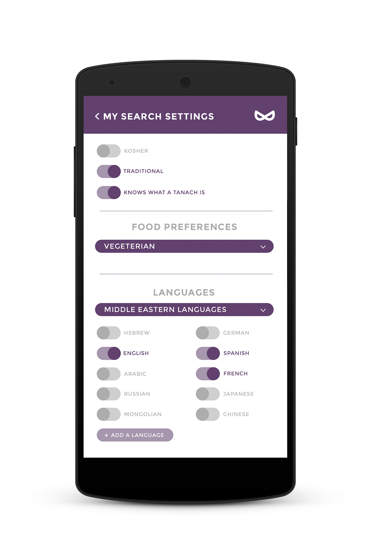
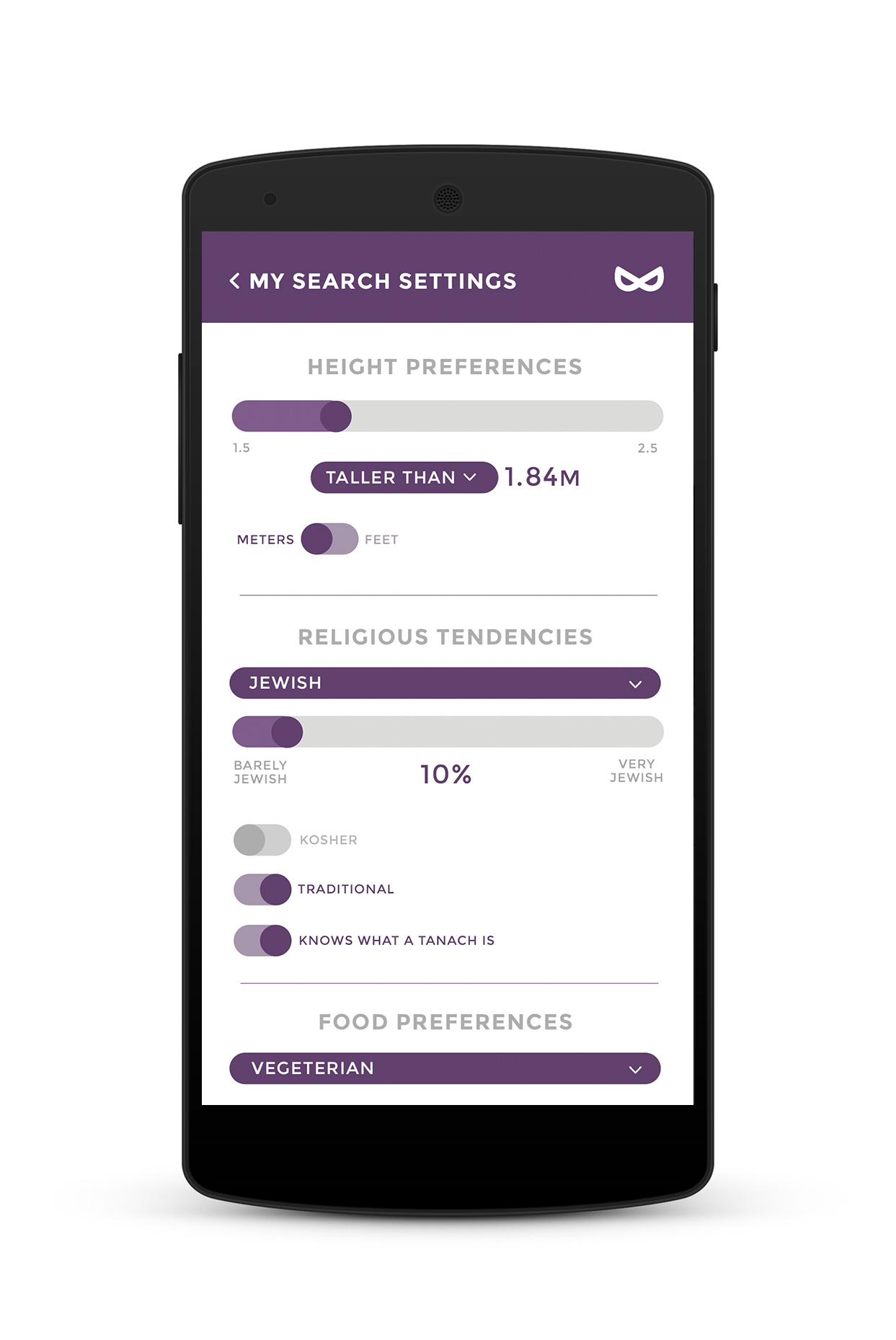
Unique personal preferences rival apps don't offer
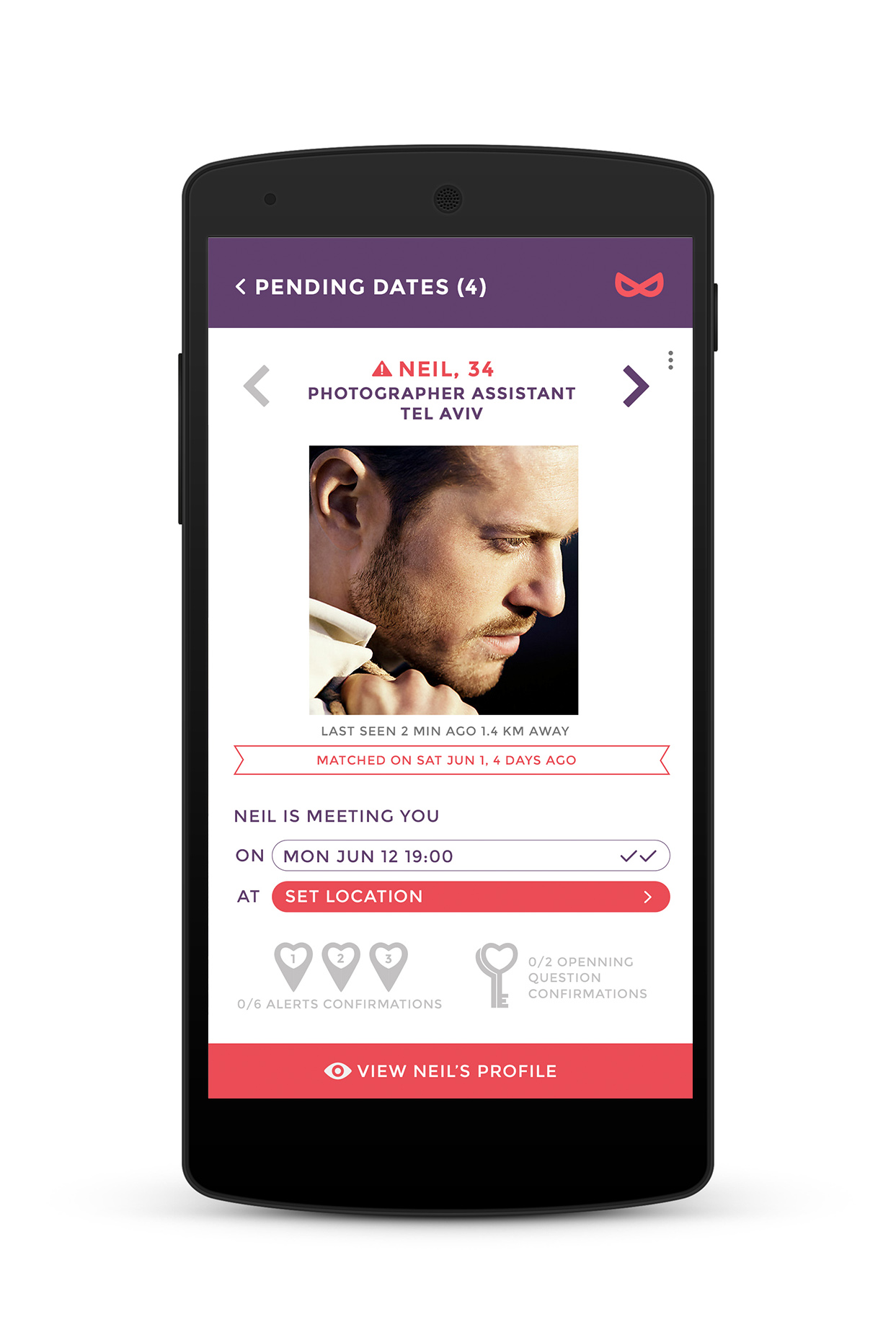
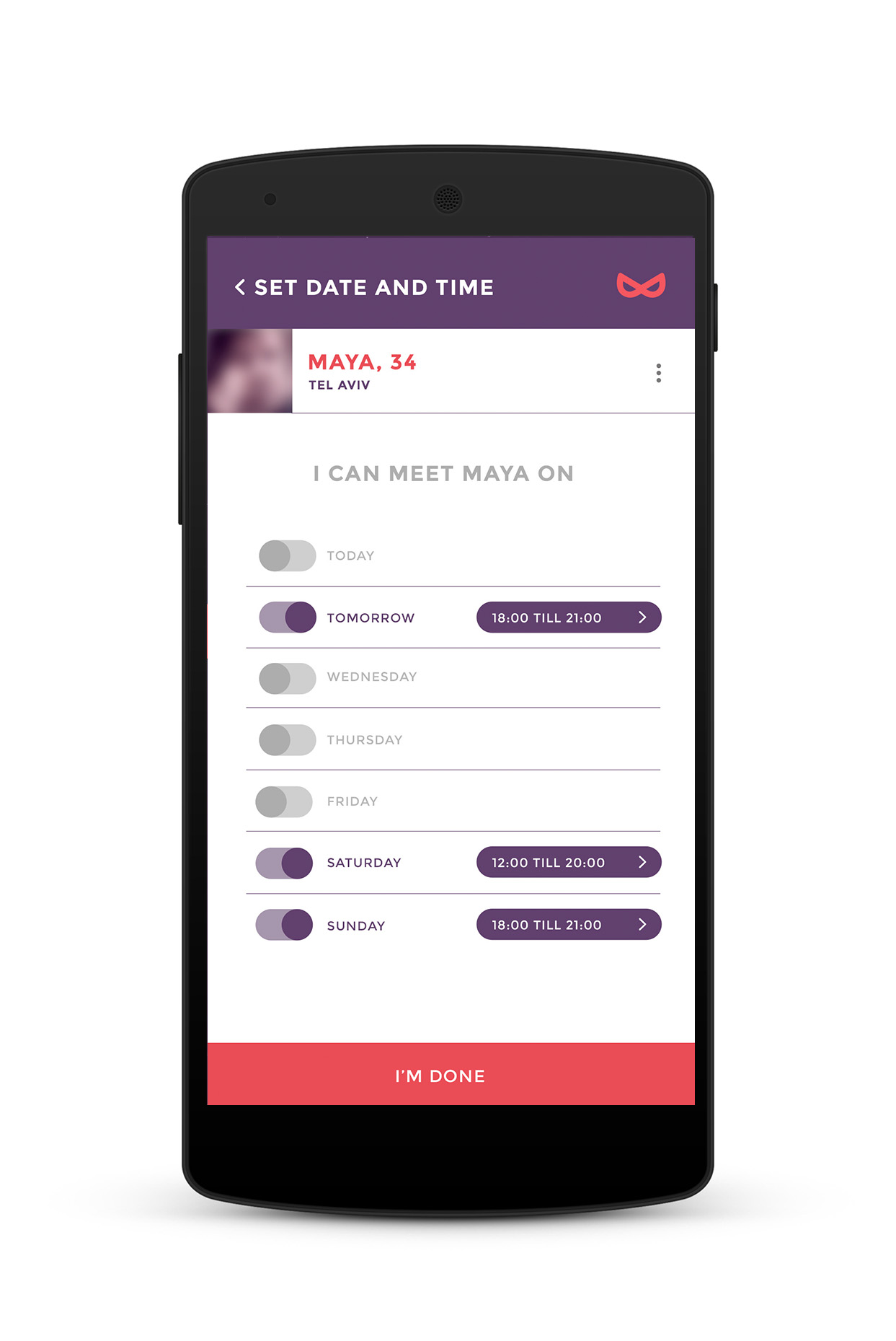
Time sensitive date setting flow instead of texting before the date
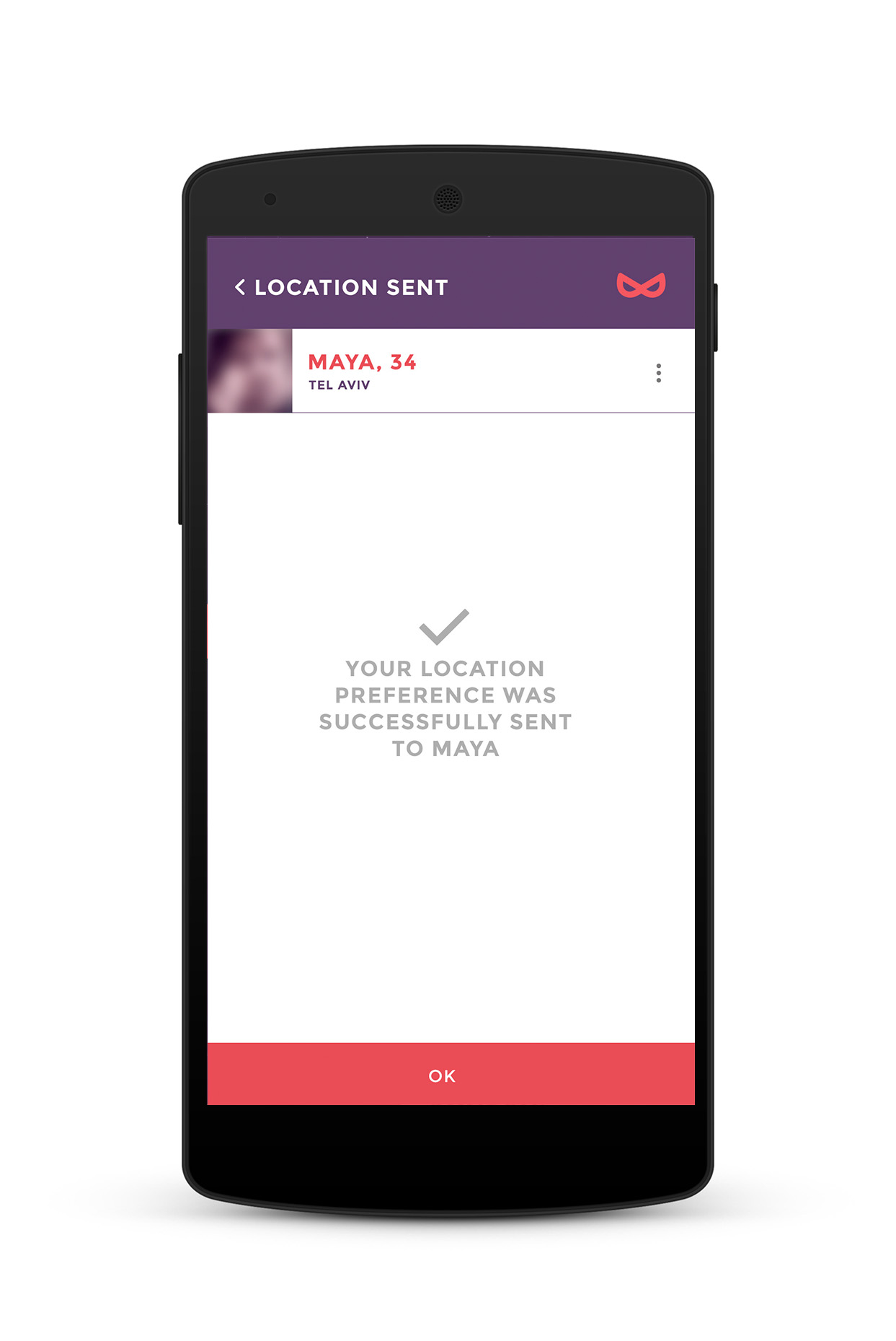
Recommended places in the area of the match made for the date location setting
Mystery purple as the main app color, other apps don't use
Dynamic browsing feature
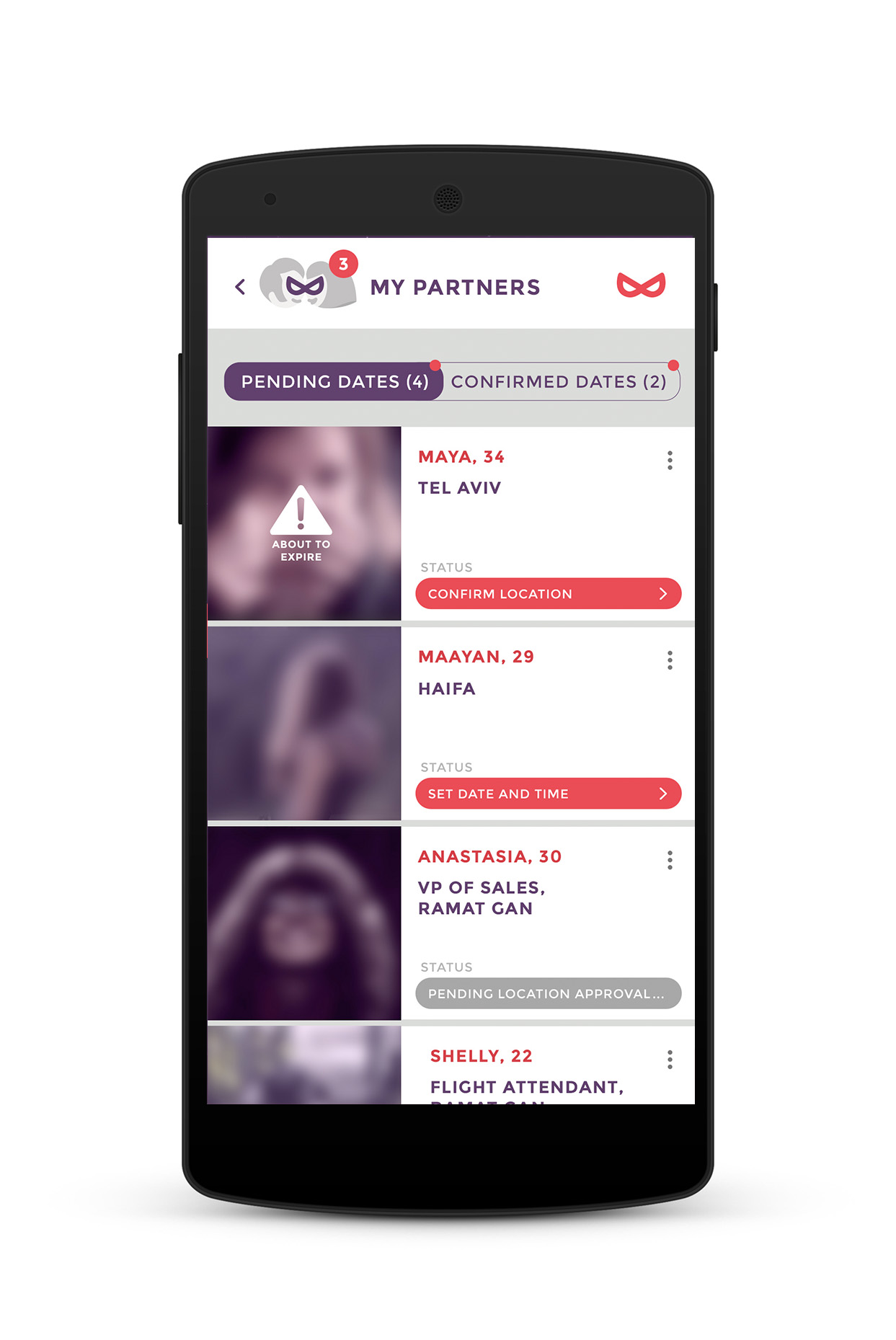
Blurred profiles for men users
Date opening question feature
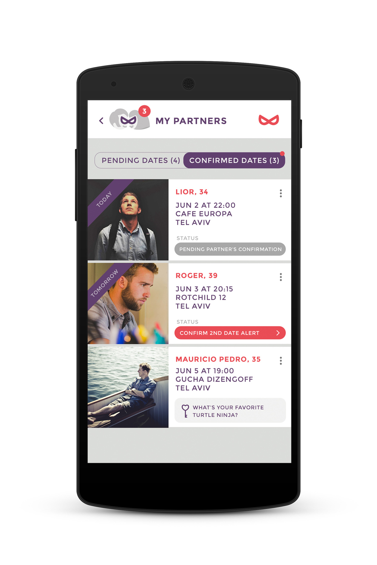
Pending and confirmed date sections
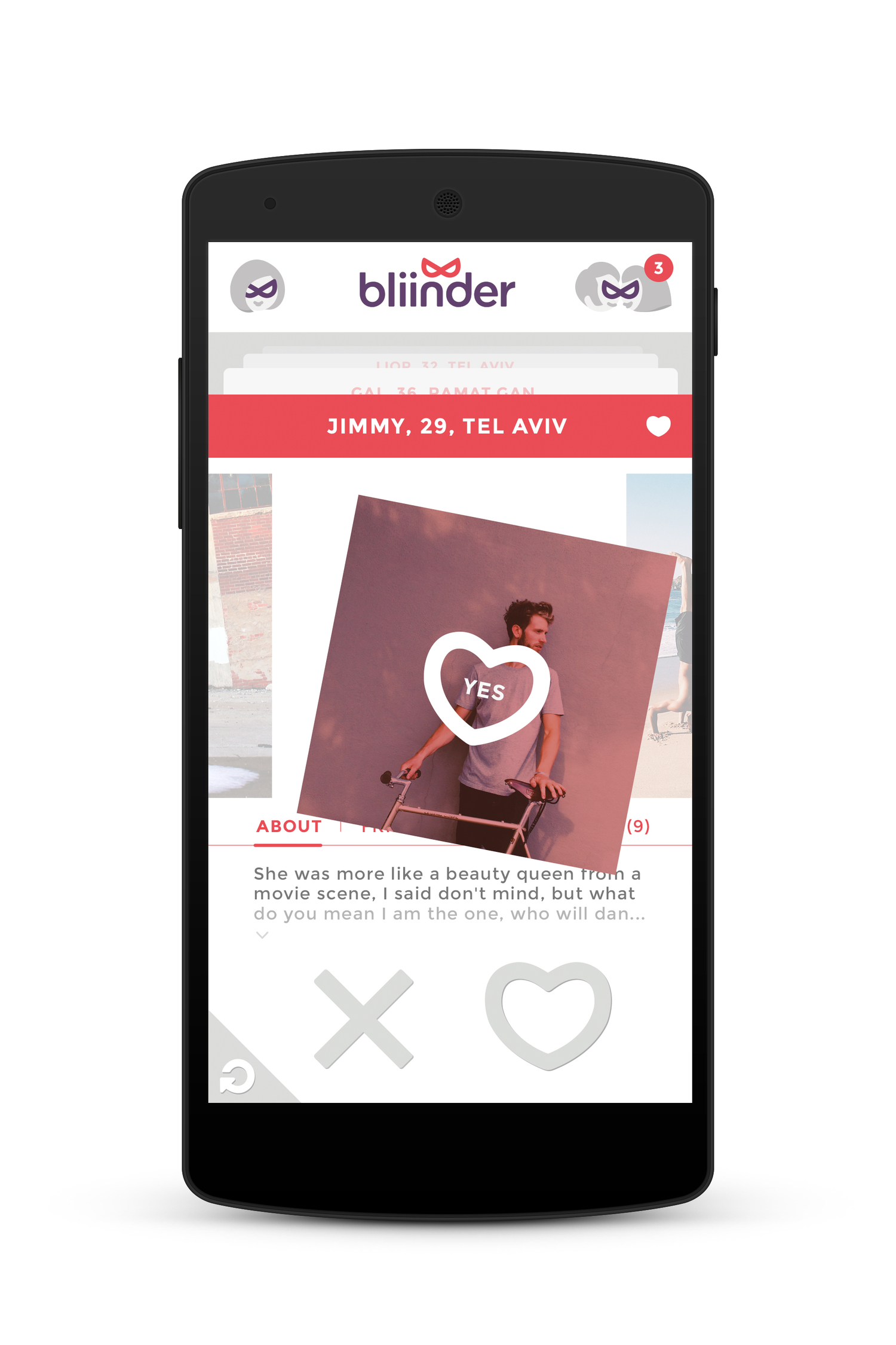
Dynamic browsing
The user is never forced to choose. Going up and down to move between potential matches like cards browsing does not limit viewing next potential matches only after a choice is made, like rival apps. Tapping "undo" to cancel previous matches without extra charge, like rival apps, also creates an advantage.
Being able to view the profile without leaving the main screen is yet another advantage. Mid-dragging right and left lets you go over the photos. Bottom-dragging right, left and down lets you see the about section.
Tapping on "yes" or "no"/ dragging the card to the right or left bottom corners releases the card from the stack.

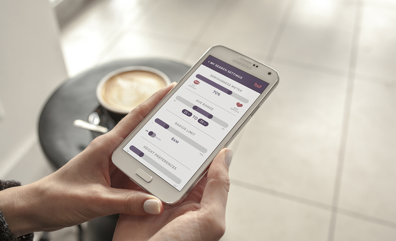
Women's perspective
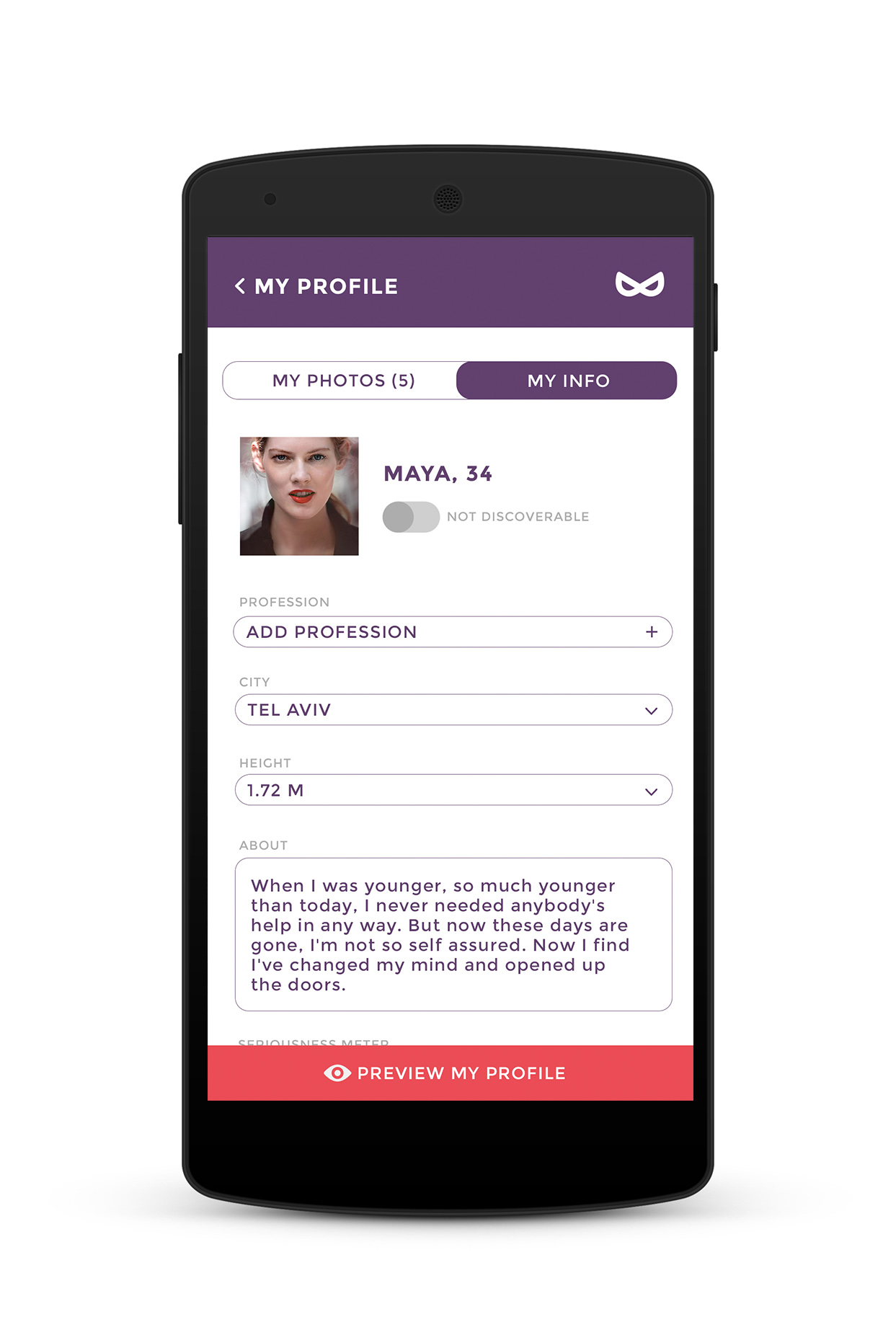
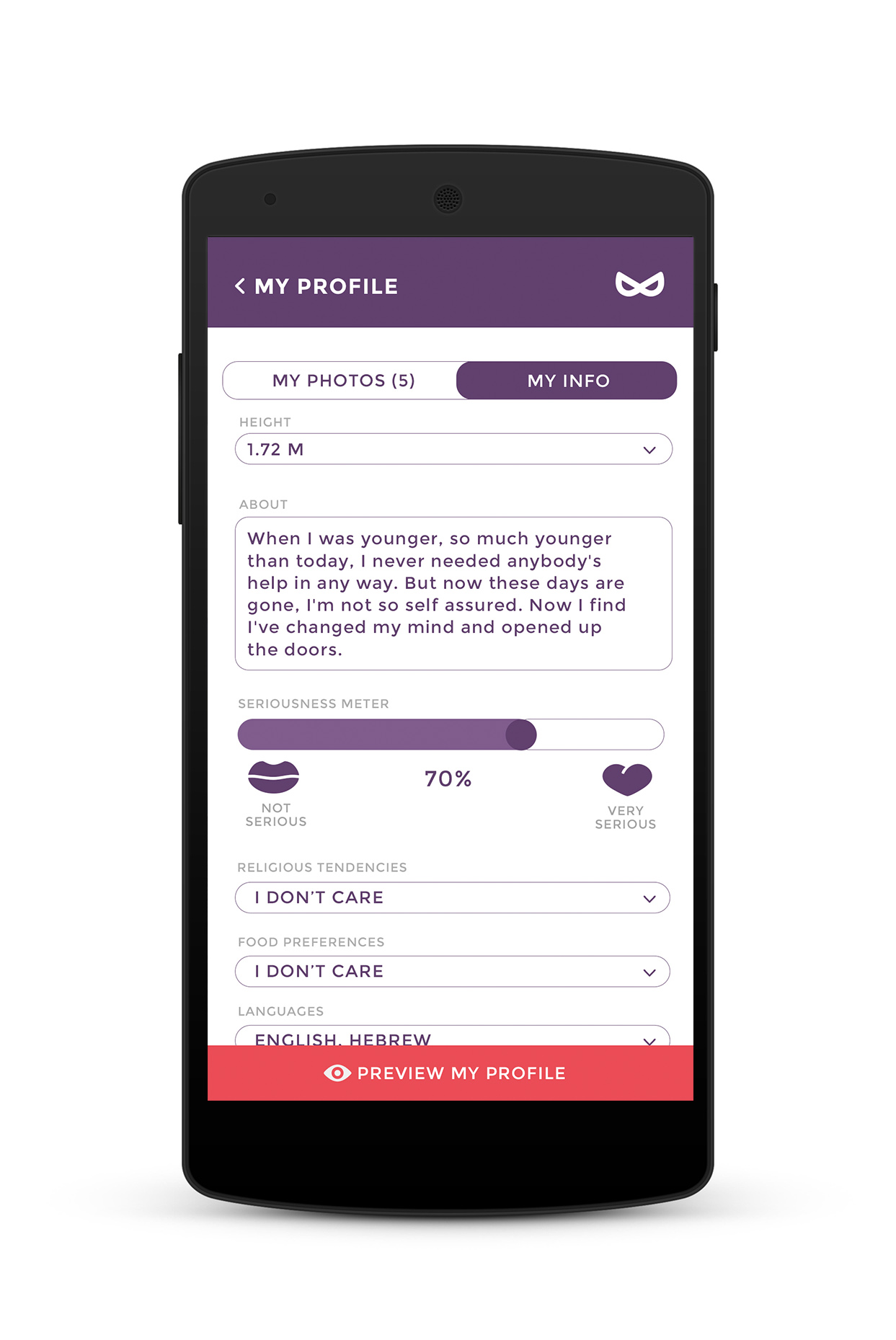
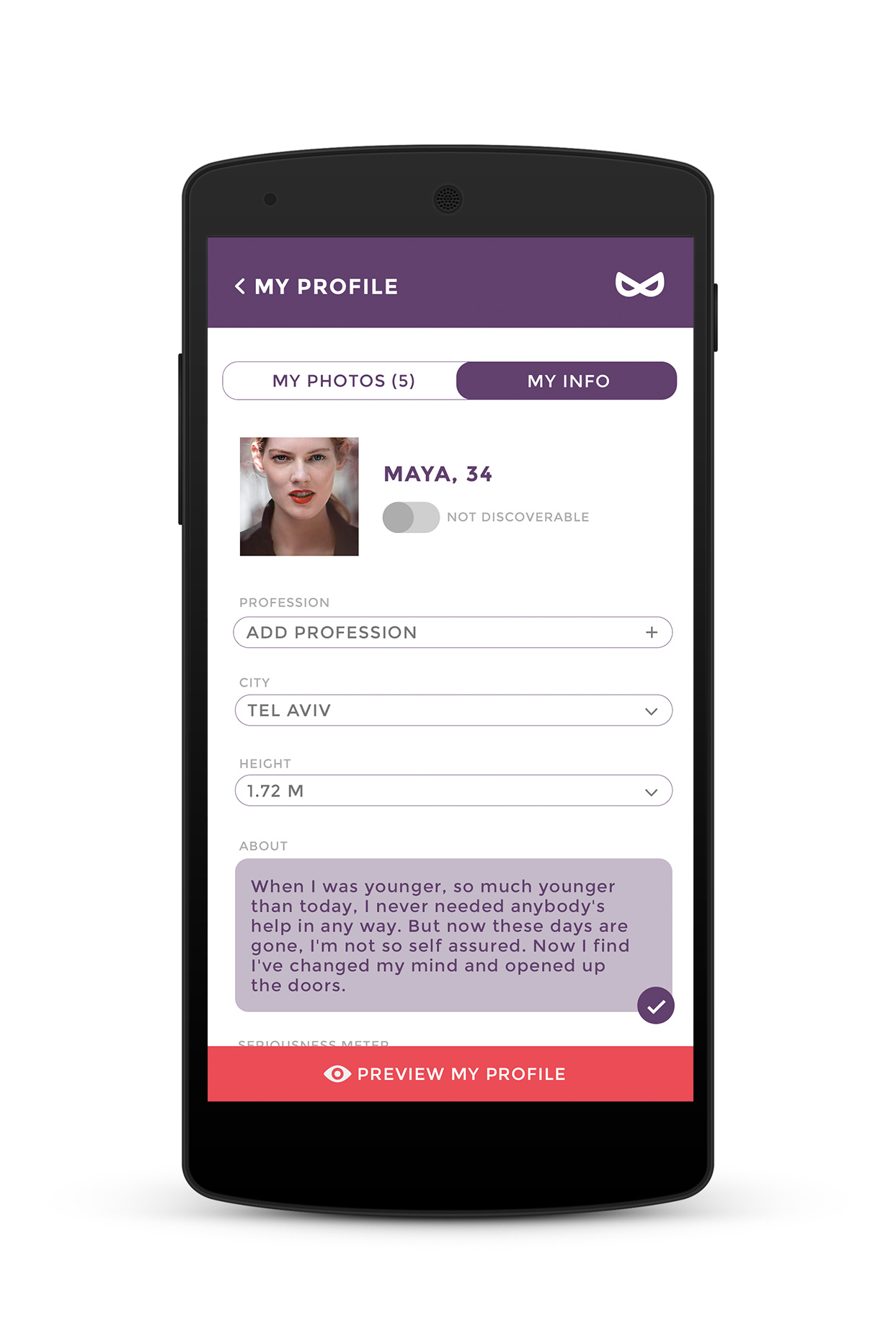
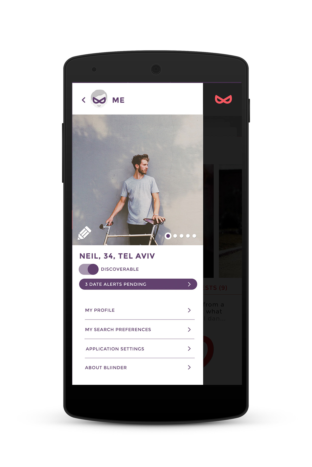
Each option reflects the flexibility of the needs of a single woman on the go: fast "discoverable" control, a dynamic seriousness meter, a wide range of search preferences of interest like food and belief system specifications, etc.
Women's perspective
Each option reflects the flexibility of the needs of a single woman on the go: fast "discoverable" control, a dynamic seriousness meter, a wide range of search preferences of interest like food and belief system specifications, etc.





You snooze you loose
If the date isn't set, it is expired.
Setting a date includes: a confirmed time and place and a confirmed key question the guy can recognize the girl by when they meet.
For ex: "What's your favorite ninja turtle"?

Man's perspective
The app is primarily intended for women, so the women get to see their match's info all along, whereas the men see their match blurred after they pick who they like.




Achieved value
Promoting an app that accommodates women's needs was great. The "cut to the chase" of setting a date right away was welcomed and attracted users, whereas the date confirmation process tested too long. The app didn't receive further funding and was short-lived.
My role
Research, illustrations, logo art direction, mobile app UX UI
Collaborators
Bee Creations (funding and support)
My role
Research, illustrations, logo art direction, mobile app UX UI
Collaborators
Bee Creations (funding and support)
My role
Research, illustrations, logo art direction, mobile app UX UI
Collaborators
Bee Creations (funding and support)
Selected Works

Site SelectionProject type
KahunProduct, Brand
WavesStrategy, Product
YoProduct
EngieProject type

LeomCampaign
Qiryat YovelProject type
RachminovWeb, Brand
Euro EstatesProject type
Russell'sWeb, Brand
BliinderProduct
Humanities FundWeb, Brand
Urban EncountersProject type
