Euro Estates
The challenge
EuroEstates offer a full service package of any rented/purchased real estate, from the property scouting to the property daily maintenance.
Being quite a while in the real estate market, they wanted to keep their classic Swiss conservative values but yet stand out in a fresh tasteful take that would show their quality and hide their shortcomings like low quality images of properties at times.
The goal
Upgrade a brand
Stand out in the Swiss real estate market
Execution scope
Brand design, website
The goal
Upgrade a brand
Stand out in the Swiss real estate market
Execution scope
Brand design, website
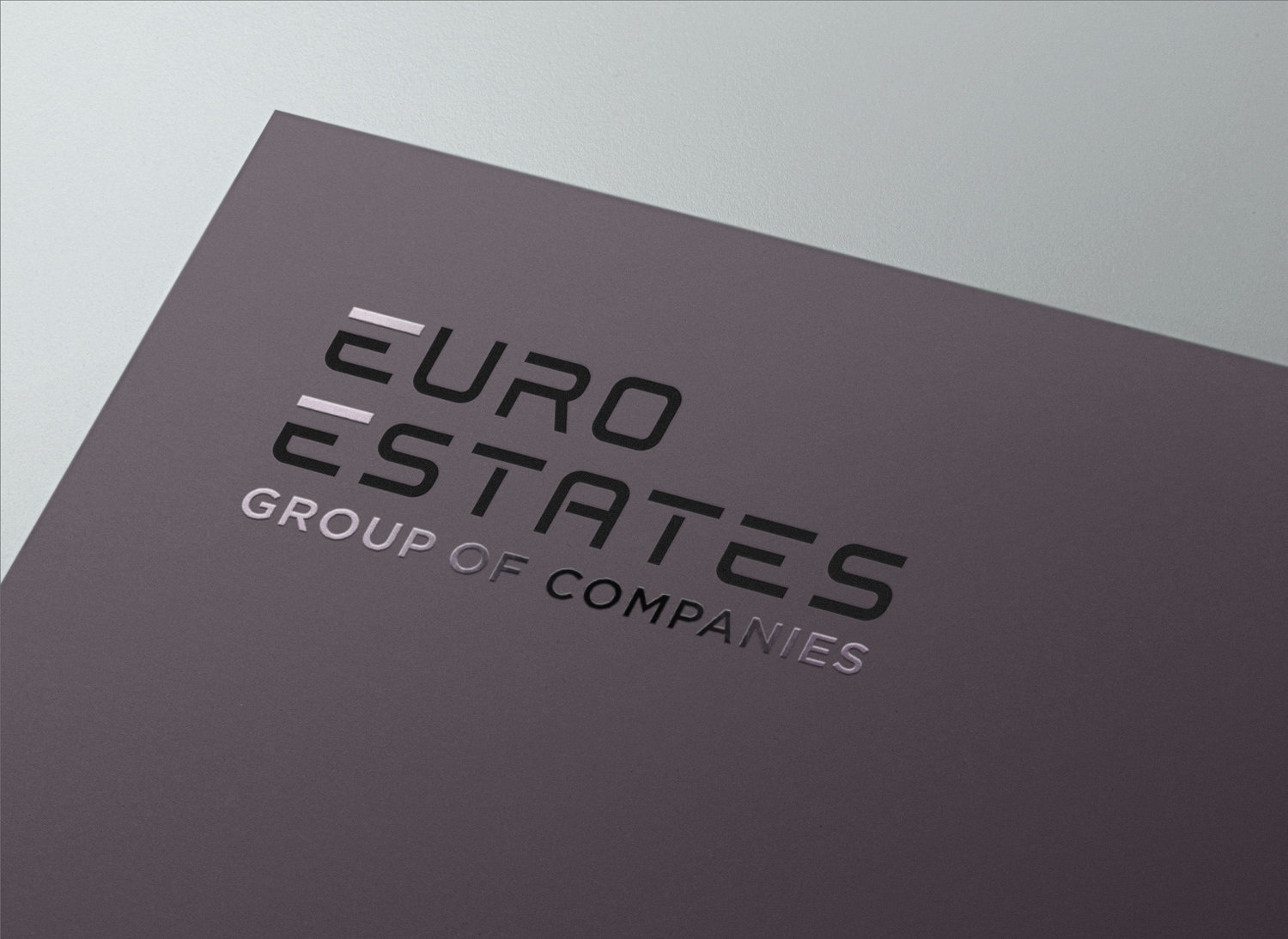
Brand concept
An "all in one" stable structure to count on
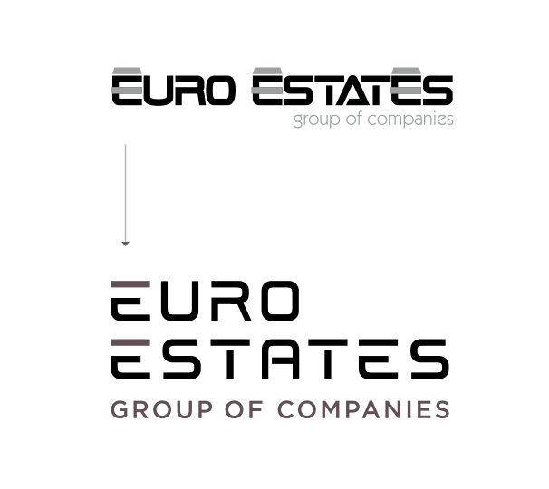
Logo design
Keeping the original horizontal structured lines and tagline, a custom font was created to set a spacious, clean and stable letter composition.
The = sign in the logo signifies the all included estate services the company provides for each resident, equally for private or commercial estates.

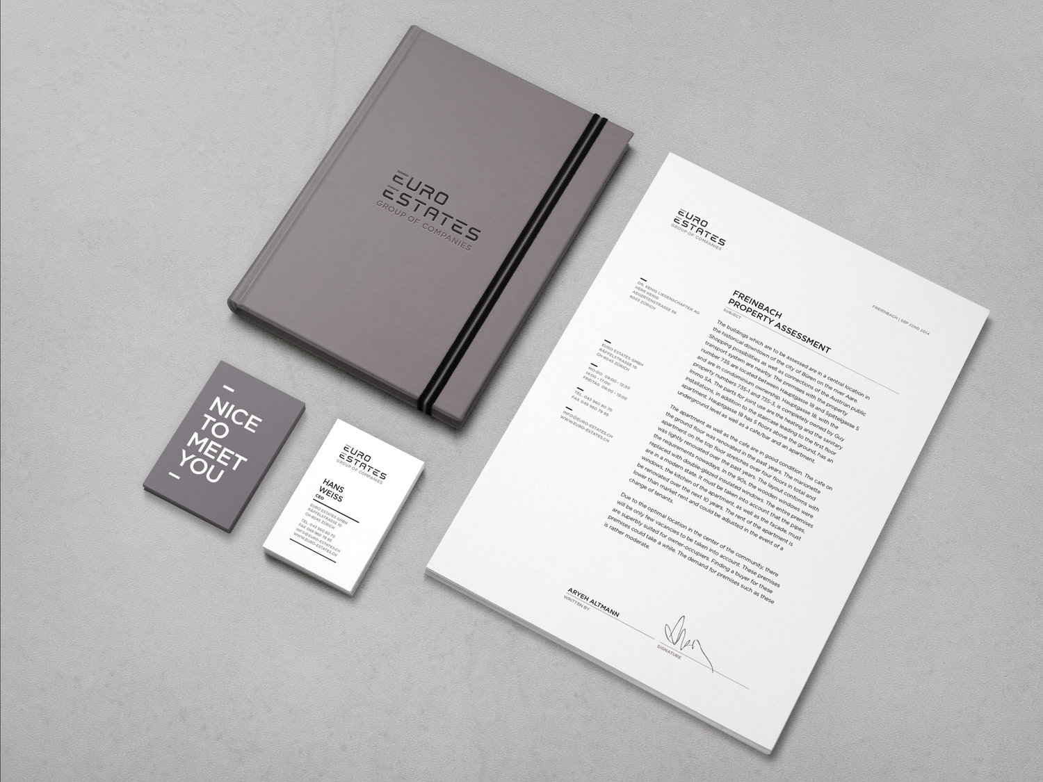
Stationary
Using the horizontal lines as stability elements resembling story floor lines of a building, each composition includes them.
The language is polite and upfront.
The color scheme is serious and strict, only a bit softened by the tasteful lilac desaturated hue of the brand.
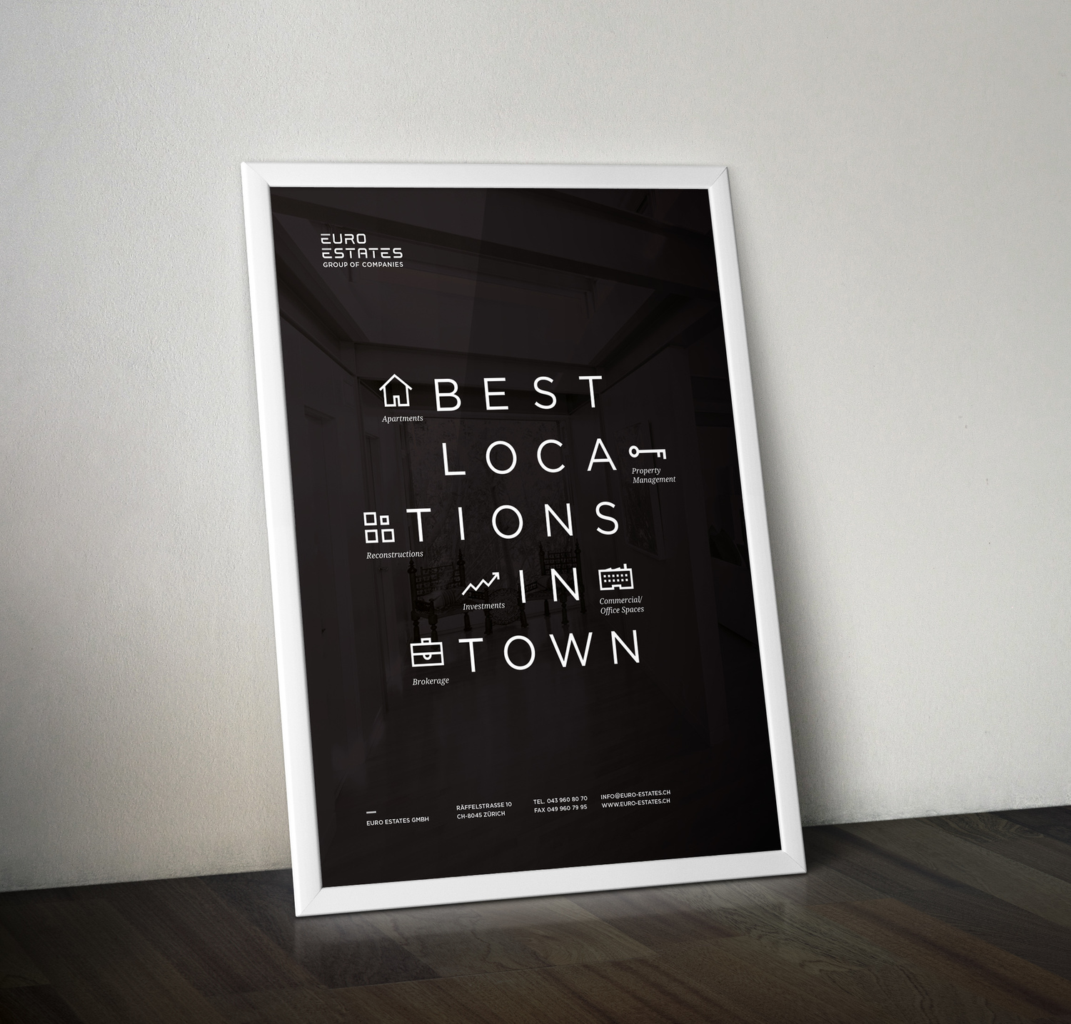
Icons
The guiding concept was to group structures of type and icons together to resemble the "all in one package" approach of the company. Practical issues were attended as well, like the possible low quality of the properties' footage, handled by using the prime lilac color of the brand as a filter on top of the footage. The icons are made as successions of the type, harmonious with the structures of the ad headlines.
Each icon represents a service the company provides.
Web
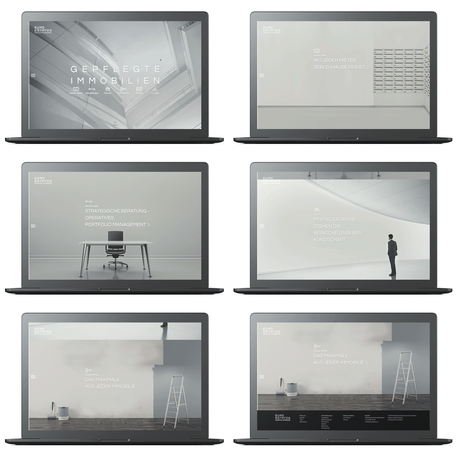
The web concept is a digital tour of an empty property ready to be rented. The movement is between different floors in the homepage (where each stop shows a different service the company provides) and between different rooms in the chosen floor in the inner pages.
The concept corresponds with the "all under one roof" service package the company provides for each client.

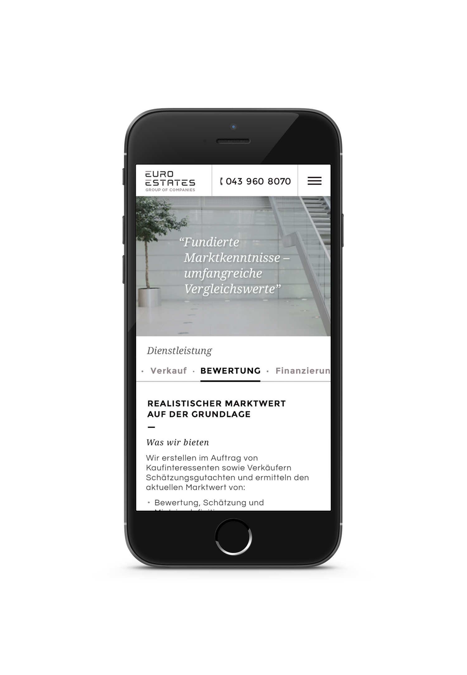
Find a property page
Commercial and residential properties can both be found in 3 viewing options - thumbnails, a list and a map and sorted according to price, room number and area.
Achieved value
Promoting a brand that takes responsibility of maintenance and property management off the hands of their tenants long after the purchase. That's a great set of values to do business with. The brand continues to exist nowadays, using brand guidelines to update the content with everyday materials.
My role
Research, brand concept and design, logo design, stationary and ad design, web UX UI icons design
Collaborators
Bee Creations (funding and support)
My role
Research, brand concept and design, logo design, stationary and ad design, web UX UI icons design
Collaborators
Bee Creations (funding and support)
Selected Works

Site SelectionProject type
KahunProduct, Brand
WavesStrategy, Product
YoProduct
EngieProject type

LeomCampaign
Qiryat YovelProject type
RachminovWeb, Brand
Euro EstatesProject type
Russell'sWeb, Brand
BliinderProduct
Humanities FundWeb, Brand
Urban EncountersProject type
