Russell's bakery
The challenge
This boutique bakery was not getting noticed in the market chaos. Its buyers were mostly recurring clients visiting the market and several high-end restaurants with fixed orders.
Its breads are high quality, organic, made with love and follow traditional bread making techniques.
Russell, the owner, is rooted in Jerusalem and its eclectic market culture. He prioritized straightforwardness and uncompromising quality in his business. Bread is his gift to people.
His intention was to be seen as a quality business in the market and grow.
The goal
Translate bakery's quality and values into an up bit brand
Show bakery's connection to the market culture
Stand out in the chaotic market area
Attract new clients inside and outside the market
Execution scope
Logo, brand language, packaging, clothing
Target audience
Israeli bread lovers of all ages visiting Jerusalem
Chosen concept
Spreading a new "market talk" of healthy breads that are being baked by values as much as they do by bakers
Values
Hand made, local, healthy, personal, of high quality
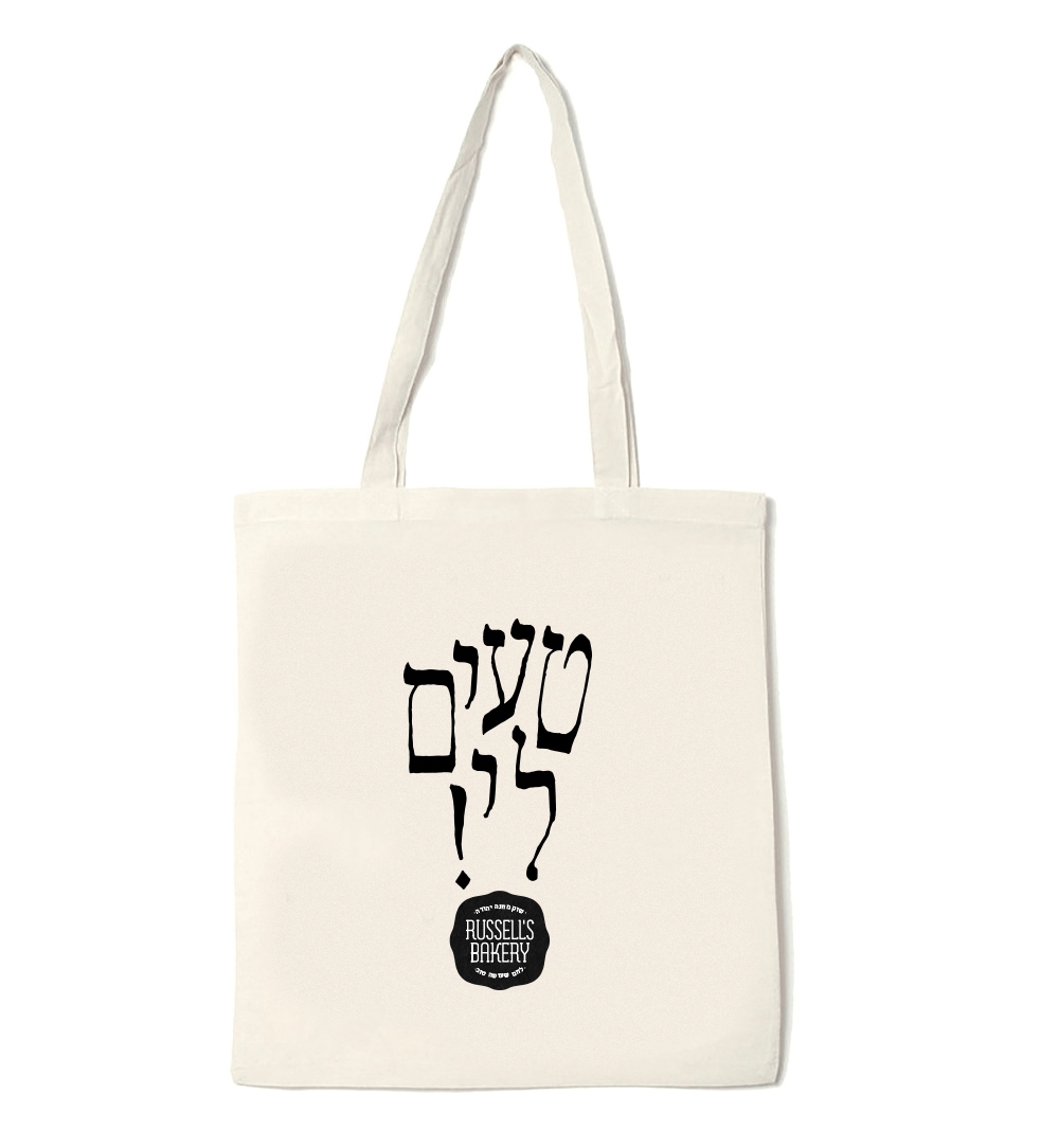
The word of the bread
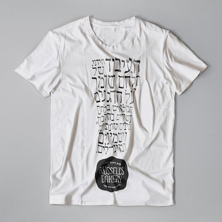
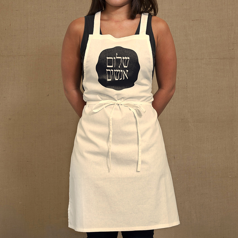
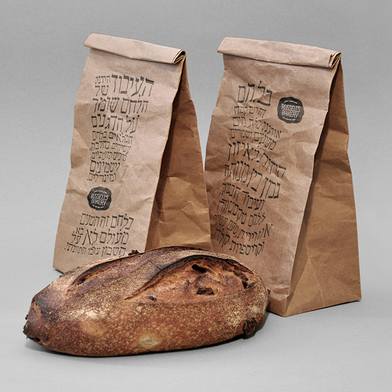
Hand made typography was an essential element in creating a "new market talk". Having lively verbal type structures (of literal facts and ingredients of Russell's breads) written on tote bags, T-shirts and packages made "the word of the bread" come alive. Their uniqueness made them attractive enough to be kept long after the bread was eaten, thus raising the awareness of potential new customers to it wherever the bags and the shirts travel (with the people that bought them)- inside and outside the market.
The feeling of spoken words depicted in written words created that market warmness of fluid talking. The brand's honest and straightforward content invited people to engage with it.
Amidst all this fluidity, the anchor of each type composition was the core element of the brand, Russell's logo, representing the reliable and authentic quality and great taste stamp consistent to all his breads.
Achieved value
Promoting a healthy and tasty brand. The concept tested as a "talk piece" and attracted the attention and curiosity of new people towards the bakery.
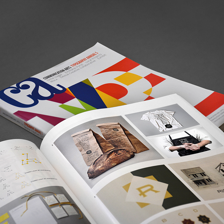
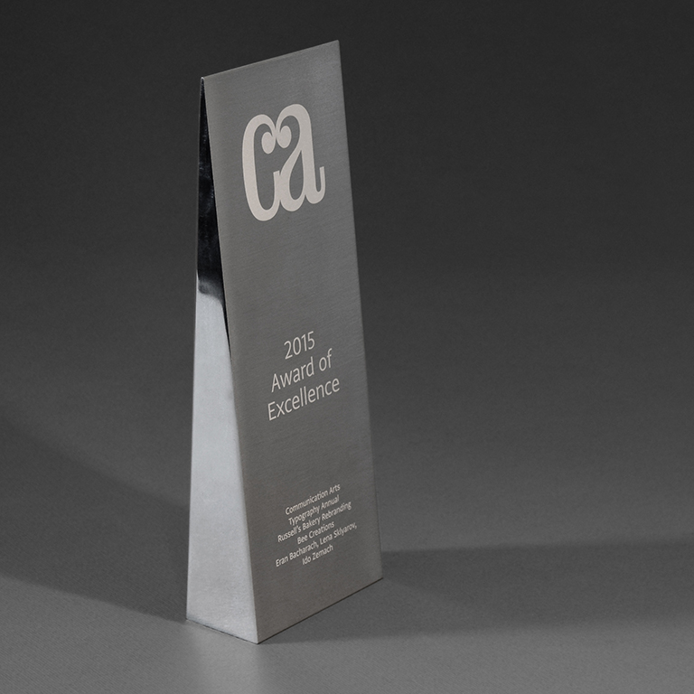
Although Russell chose to execute a different direction in the end, the concept developed for his bakery got a CA award of excellence.
My role
Brand concept, marketing strategy, art direction, logo design, content copy, brand language and packaging design
Collaborators
Franzi Bauer (producing the whole hand made ABC according to instructed letter samples), Bee Creations (support and feedback)
Selected Works

Site SelectionProject type
KahunProduct, Brand
WavesStrategy, Product
YoProduct
EngieProject type

LeomCampaign
Qiryat YovelProject type
RachminovWeb, Brand
Euro EstatesProject type
Russell'sWeb, Brand
BliinderProduct
Humanities FundWeb, Brand
Urban EncountersProject type
